Althea Rebrand
Althea Packaging Redesign
Sentril

Hocking Stuart
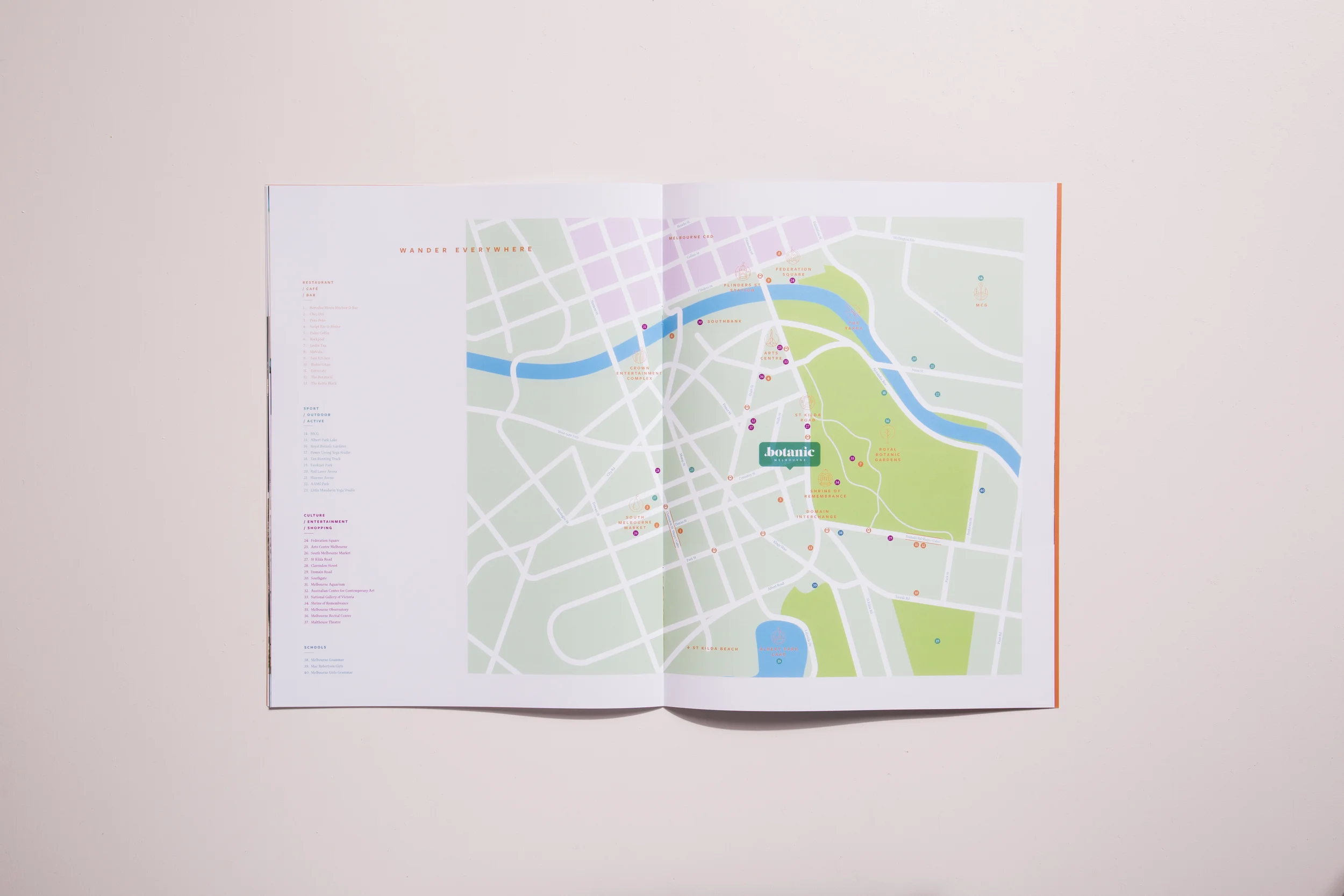
Botanic Melbourne
Goldeluck's Doughnuts
CHLM
BDESIGNFEST

Boroondara Snapshot
Netherduet
112 Brooklyn Pretzel Co.
2014 Melbourne Flower Show
Field Guide to Extinct Australian Megafauna
Kincha Iced Tea